Data Analysis
Mapping the raw data of ALPR readings over time reveals specific neighborhoods encountered more surveillance than others, as seen in the image below. The heatmap provides an overview of neighborhoods with repeated surveillance by plotting the raw readings against time (between 2010 and 2014) and number of records collected monthly.
The finding gets more interesting as we gauge deeper into the data. I aggregated the number of license plate readings per day and plotted it against time to show the trend.
The flat lines on the time axis showing zero readings corroborate to missing data in the released records. The data retention policy cited earlier was only recently determined by Oakland PD, until which point all the data was recorded and retained infinitely. I spoke to Mike Katz-Lacabe from the Center for Human Rights and Privacy, and a well-informed privacy expert from the Bay Area to understand the piece about missing data. He explained to me how the lack of a defined retention policy meant data was being stored in external hard drives and damaged. There is a possibility that Oakland PD was not able to release the records because the data is lost.
We can see from the timestamp graph the are tallest spikes are in August 29, 2012 and August 2, 2014. Once we dive deeper into the data, we can find out if that corresponds to an important political event, which could point to why more records were collected during certain time periods.
In the second part of the analysis, I tried to find out if minority groups, such as African-Americans and Hispanics are being disparately targeted. This means there will be more patrol equipped with ALPR technology in neighborhoods with higher percentages of the African-Americans or Hispanics. In order to make the analysis accurate, I normalized total readings in a given neighborhood by population. This becomes tricky because neighborhoods near Oakland Airport for example, will have a lower population and a high number of records owing to the fact that surveillance technology is historically more prevalent near and inside airports. This makes the processed data slightly inflated and not necessarily always useful in making calculated assumptions about what is actually happening. The data nevertheless should not be entirely discounted. The map shows areas like Downtown Oakland having a higher intensity of ALPR records which is accurate given it is a central location.
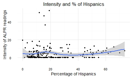
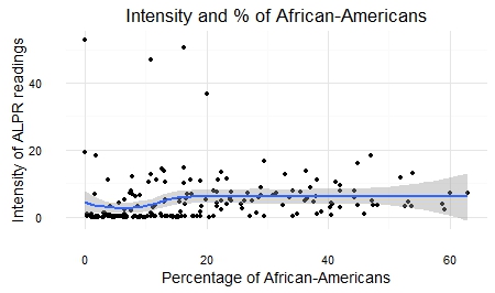
To understand the implication of surveillance technologies such as ALPR, we dived deeper into the data and mapped records on two minority groups, Hispanics and African-Americans. When compared with percentages of African-American or Hispanic population, we find areas such as Oakland Airport have high concentrations of African-American population and high ALPR intensity. Deriving any positive correlation between readings and concentration of racial groups can throw us off; the intensity of ALPR is misleading. In addition to more surveillance technology, the high intensity of readings near airports can be explained by the fact there are more vehicles near the airport. On the other hand, neighborhoods with high percentage of Hispanics show relatively high intensity of ALPR readings consistently, ranging between 0.4 to 7.0 units.
In order to draw a statistically significant relationship, I plotted the intensity of ALPR readings against the percentage of Hispanics and African-Americans in the population. Contrary to what the maps showed, the graphs did not reveal any significant correlation.
A similar comparison can be drawn between the intensity of ALPR readings and household income. Temescal and Oakland Airport are both low-income areas with two of the highest brackets in ALPR intensity. In San Leandro, Castro Valley and Lakeshore, where 12-18 percent of households have an annual income of over $200,000 have lower intensity of ALPR records. Cyrus Favrier, senior business editor at Ars Technica resonates my finding in his investigative report from March 2015. He refers to over 4.6 million records collected between the same time frame as mine where patrol cars mounted with ALPRs were seen more frequently in low-income neighborhoods.
.Although the data reveals several intriguing insights, several missing data made it difficult to draw significant and statistically accurate causal relationships. What is certain is that our private location data is being collected routinely and retained for a substantial period. This poses a threat to Americans' First Amendment rights. It is also clear police patrol is more common in low-income neighborhoods. This can occur because low-income neighborhoods are assumed to experience a higher crime rate, and "proving" this will only further confirm the hypothesis.
Contact
This project was done as part of Data Visualization, a graduate level course offered at UC Berkeley's School of Journalism. All images used for this project is licensed under Creative Commons. Attribution has been provided for all data sources. The project would not have been possible without the direction and support of the course faculty, Peter Aldhous.
To know more about the project or provide feedback, please email me.